Categories
Books

Books of The Future!

Just got caught up reading a very lengthy (and contentious) comment thread over at Making Light regarding Amazon vs. Macmillan and eBooks in general, and it got me thinking. One of the commenters puts forth the idea that eBooks are the ultimate future of reading, and that those silly old things made out of paper will disappear into history shortly enough once eReaders make it big.

I see a couple of problems with this. First off, the 250 unread books currently looming on my bookshelves beg to differ. They sure aren’t going anywhere anytime soon. Same with the millions of books in new and used book stores and libraries. The commenter theorizes that non-electronic books are going to become collector’s items for folks (like me) who just can’t let go of physical books and want to live in the past.

The problem with this, though, is that the argument is completely backwards. eReaders are the luxury item. The people who are most interested in eReaders are people who read a LOT because they see the attraction of carrying around 100s of books in their pockets and also because they think they can justify the sticker price. I definitely know that if I took the plunge and dropped several hundred dollars on an eReader any time soon that I’d feel the need to buy all my new books on that platform to justify the cost.

Categories
Books

Inexplicable Cover Redesigns

I’m continually fascinated by the process of book cover designs and redesigns. I actually follow several blogs that focus on nothing but the subject of new book cover designs, often comparing hardback to paperback and US to UK or international versions. It’s really interesting how books are sold in completely different ways in different countries. Re-released versions are also alternately fascinating and disappointing, depending on the thinking behind the updated version. Here’s a good example:

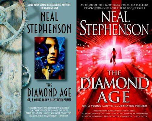
The Diamond Age, Old vs. New

On the left is an earlier cover for The Diamond Age by Neal Stephenson. The cover on the right is for a version re-released this year to coincide with Stephenson’s upcoming book, Anathem. For some reason all of Stephenson’s books (except for the Baroque Cycle) are being re-released with covers that match the style of Anathem: a shadowy figure, lit from behind and walking or running through a doorway at the end of a long hall or large space.

It’s kind of bizarre, especially since the new cover makes The Diamond Age look more like a Jason Bourne book than a post-cyberpunk / steampunk / fantasy novel about a girl and the virtual world that exists in her diary. The old cover may be a bit dated and “of its time”, but I think it does a much better job of communicating what the book is actually about, with its juxtaposition of rusty gears and amorphous 3D imagery.

If you’re interested in checking out a few good blogs focusing on book cover designs, here’s my reading list:

  1. The Book Design Review
  2. …by Henry Sene Yee Design
  3. Book Covers Anonymous
  4. Caustic Cover Critic